Tuesday, October 31, 2023

REPORT 21: EVALUATION OF THE KPI RATING SYSTEM

This year, the NCAA is allowing the Women's Soccer Committee to use an additional rating system when it evaluates teams, in addition to the RPI.  This is a good thing.

The additional rating system the NCAA is allowing the Committee to use is the KP Index, or KPI.  In 2022, the NCAA allowed the Division I Women's Field Hockey Committee to use the KPI to supplement the RPI.  I do not know who selected the KPI as the particular additional system for field hockey.  I believe the NCAA staff selected it for women's soccer since it already was in use for field hockey.

A big question is whether the KPI is a good supplemental system for DI women's soccer.  In my opinion, as I will show below, it is not.

In terms of how KPI ratings match generally with game results, the KPI is fine as a system:


In this table, the ARPI 2015 is the current NCAA RPI.  Massey is the Kenneth Massey system, which he has run for many years.  The URPI 50 50 SoS Iteration 15 is the Balanced RPI.  KPI ratings are available only for years since 2017, and I was able to use Massey ratings only through 2019.  For the current NCAA RPI and the Balanced RPI, I was able to use data from 2010 through 2022.  I excluded Covid-affected 2020.

The table shows the consistency of ratings with game results.  I determined, for each system, the percentage of games in which the team with the higher rating, after adjustment for home field advantage, won the game.  I did this using only games that ended in wins or losses since the percentage of tie games differs from year to year and I did not want those differences to deceptively skew the results.

In the percentages, in the Overall column a difference of 0.1% represents a difference of about 3 games per year, out of about 3,000, in which game results match ratings.  In the Top 60 column, a difference of 0.1% represents a difference of about 1 game per year, out of about 1,000.

As you can see, the differences in consistency of ratings with game results are not large.

Knowing that for DI women's soccer, game results will be inconsistent with ratings in a significant number of games as the above table shows, one would hope that the inconsistencies would be due either to (1) actual changes in teams' performance over the course of the season or (2) true upsets, which should be randomly distributed.  And, conversely, one would hope that the inconsistencies are not due to rating system discrimination against or in favor of teams based on characteristics not related to performance.  In particular, one would hope that the inconsistencies are not due to discrimination among teams based on the conferences they are in or the geographic regions in which they are located.

The following table shows whether the four rating systems discriminate among teams based on the conferences they are in:


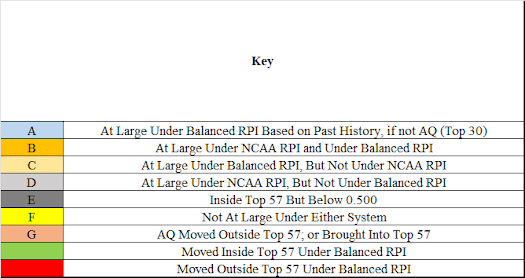
This table is based on a system that evaluates how well the ratings of teams in a particular group, such as a conference, match with their results against teams from other similar groups, such as other conferences.  For a detailed description of the system, see RPI: Measuring the Correlation Between Teams' Ratings and Their Performance.

This particular table deals with the ratings compared to the results of each conference's teams, as a group, in games against teams from other conferences.  If the results of a conference are consistent with with what the ratings say they should be, then the performance percentage of the conference is 100%.  If the results are better than the ratings say they should be, then the performance percentage is above 100%.  If the results are poorer, then the performance percentage is below 100%.

The table looks at conference performance three ways:

In the first four columns with percentages, it looks at the most closely rated 10% of all games.  These are the games in which differences between ratings and results are most likely to show up.

In the next four columns, it looks at the most closely rated 20% of all games.  I have included these columns to take into account that for the KPI, the 2017 through 2022 data set is relatively small and I was concerned that lack of data might unfairly skew the 10% results.

The final four columns are based on having broken down all of the games into the most closely rated 10%, the second most closely rated 10%, and so on in 10% segments so as to cover all games.  The system then calculates the performance percentage for each segment.  The final four columns are based on the average performance percentage across all 10 segments.  This gives a picture of the net effect of any difficulty the rating system has rating teams from a conference in relation to teams from other conferences.

Using the 10% group as an example, the first column for that group shows the performance percentage of the conference that performs the best in relation to its ratings -- 124.9% for the current NCAA RPI.  The next column shows the percentage for the poorest performing conference -- 66.8%.  The next column shows the difference -- the Spread -- between those two percentages -- 58.0%.  The next column is based on the differences from 100% of all of the conferences, added together -- the Over and Under Total -- 305.9%.  The Spread and the Over and Under Total are measurements of how well the system is able to rate teams from the different conferences in relation to each other.  The lower the percentages, the better.

As the table shows, the KPI has the same problem as the current NCAA RPI when trying to rate teams from the different conferences in relation to each other.  One must be careful not to pay too much attention to the exact KPI numbers due to its limited data set, but the table is clear that it has a conference rating problem.  The Balanced RPI, on the other hand, performs much better than either the KPI or the current NCAA RPI.

There is another aspect, of rating teams from the different conferences in relation to each other, that the above tables do not show.  This is shown in charts that show how the conference performance percentages relate to conference strength.  Here is a chart for the current NCAA RPI.


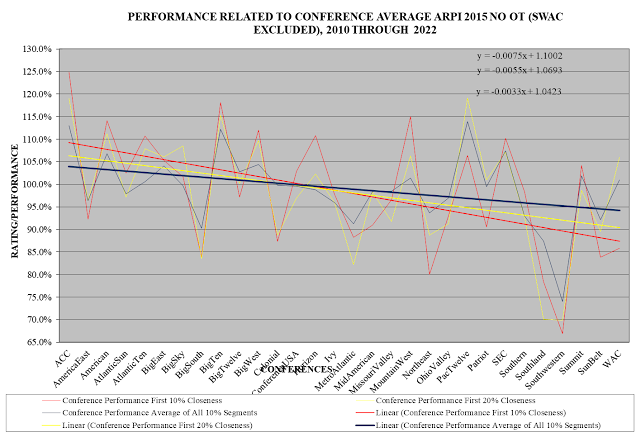
In this chart, the conferences are arranged from left to right in order of the average RPIs of their teams, with the best average RPI on the left and the poorest on the right.  (I have not included the Southwestern Athletic Conference because its performance percentage is so poor I believe it would make the trends overly steep.)  The red is for performance in the most closely rated 10% of games, the yellow for 20%, and the dark blue for the average across all 10% segments.  The straight lines are computer generated trend lines showing the relationship between conference strength and how conferences perform in relation to their ratings.  The three formulas in the upper right of the chart are formulas for the three trend lines.  The chart shows that under the current NCAA RPI, on average, teams from stronger conferences, in non-conference games, perform better than their ratings say they should and teams from weaker conferences perform more poorly than their ratings say they should.  In other words, on average, the current NCAA RPI discriminates against teams from stronger conferences and in favor of teams from weaker conferences.

Here is the same chart, but for the KPI:


You can see that, on average, the KPI discriminates against teams from stronger conferences and in favor of teams from weaker conferences.

Here is the same chart, but for the Balanced RPI:


As you can see, the Balanced RPI has minimal discrimination in relation to conference strength.

The following table summarizes these three charts:


Using the current NCAA RPI and the closest 10% group of games as an example, the first 10% column shows the highest point of the 10% group trend line on the left of the current NCAA RPI chart -- 111.6%, as determined based on the 10% group trend formula.  The second 10% column shows the lowest point of the trend line on the right -- 88.1%.  The 10% Spread column shows the difference between the performance at the high end and the low end of the trend line -- 23.5%.  This difference is a measure of the amount of discrimination against stronger and in favor of weaker conferences.  As you can see, looking at the 10%, 20%, and All columns, both the current NCAA RPI and the KPI have significant discrimination; and the Balanced RPI has minimal discrimination and, when looking at all the 10% groups combined, virtually no discrimination.

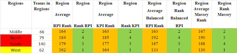
Here are tables and charts like the ones for conferences, but instead for the geographic regions within which teams are located:


As you can see, both the current NCAA RPI and the KPI have significant discrimination based on geographic regions; and the Balanced RPI has minimal discrimination and, when looking at all the 10% groups combined, virtually no discrimination.

The bottom line is that the KPI is not a good supplemental rating system for DI women's soccer.  Rather, it has the same defects as the current NCAA RPI:  It discriminates against stronger conferences and geographic regions and in favor of weaker ones.

The NCAA definitely needs to allow the Women's Soccer Committee to use a rating resource in addition to the current NCAA RPI (although discontinuing use of the current NCAA RPI in favor of another system would be better).  Using the KPI as the additional resource, however, is not helpful as it only reinforces the current NCAA RPI's discrimination defects.  Thus although using another rating system is good, using the KPI as that system is not.

Monday, October 30, 2023

REPORT 20: UPDATE INCORPORATING RESULTS THROUGH SUNDAY, OCTOBER 29

This is my  week eleven report for the 2023 season.

In the first table below, I show teams’ current RPI rankings, including showing teams in the history-based candidate groups as of this point in the season for NCAA Tournament #1 through #4 seeds and at large selections.  (I do not show candidate groups for #6 through #8 seeds, as there is only one year of data for those groups, which I do not believe is enough precedent to establish reliable groups.)  In addition, if you check the Team column, you will see some highlighted teams.  These are teams outside the current RPI Top 57, but inside the Balanced RPI Top 57.  Except for Washington State and Portland, which are in the current RPI candidate group for this week, they are teams that likely will not get at large selection consideration from the Committee due to its use of the current RPI even though, according to the Balanced RPI, they should get consideration.

In the other  three tables, I show, using the actual results of games played through October 22 and simulated results for games not yet played (including simulated conference tournaments):

1.  Teams’ simulated end-of-season ranks using the current NCAA RPI and my Balanced RPI;

2.  Based on the current NCAA RPI, teams in candidate pools for NCAA Tournament #1, 2, 3, and 4 seeds and for at large selections and where they fit within the pools; and

3.  Likely differences in at large selections for the NCAA Tournament if the Women’s Soccer Committee were to use the Balanced RPI rather than the current NCAA RPI.

The background for the information in the three tables is in 2023 Reports 1 through 4.  NOTE: In determining the simulated results of games not yet played, I use teams' current NCAA RPI ratings based on games played through October 29.

Summarizing the likely differences in at large selections for the NCAA Tournament in changing from the current NCAA RPI to the Balanced RPI, derived from the last table below:

At Large Candidate Teams:  Eleven teams that are not at large candidates under the current NCAA RPI are candidates under the Balanced RPI.  Of these, 1 is from the Middle, 0 from the North, 4 from the South, and 6 from the West regions.  Nine are from Power 5 conferences and 2 are not.  One of them, from the West and not from a Power 5 conference, is an Automatic Qualifier.

No Longer Candidate Teams:  Eleven teams that are at large candidates (or Automatic Qualifiers) under the current NCAA RPI are not candidates under the Balanced RPI.  Of these, 2 are from the Middle, 1 from the North, 7 from the South, and 1 from the West regions.  None is from a Power 5 conference, 11 are not.  Of the 11, 5 are Automatic Qualifiers.

Selected Teams: Five teams that either definitely (5 teams) or likely (0 teams) are not at large selections under the current NCAA RPI likely are at large selections under the Balanced RPI.  Of these, 1 is from the Middle, 0 from the North, 1 from the South, and 3 from the West regions.  Four are from Power 5 conferences and 1 is not.

No Longer Selected Teams: Five teams that likely are at large selections under the current NCAA RPI likely are not at large selections under the Balanced RPI.  Of these, 1 is from the Middle, 2 from the North, 2 from the South, and 0 from the West regions.  Two are from Power 5 conferences and 3 are not.

Current RPI Rankings

The first table below shows teams’ current RPI ranks, their strength of schedule contributor ranks, their opponents’ average RPI ranks, and their opponents’ average strength of schedule contributor ranks.  These will help you see the differences between team RPI ranks and strength of schedule contributor ranks -- in an ideal rating system, those ranks should be the same, but under the current NCAA RPI they are not and often are not by a wide margin.

In addition, the table shows the same rank items for my Balanced RPI.

And, on the left, the table shows teams that are potential #1 through #4 seeds and at large selections, at this stage of the season, based on Committee decisions since 2007.  The poorest ranked team in any candidate group is the poorest ranked team as of the current week that the Committee gave a positive decision to in its end of season decision process.

The second table shows average ranks for conferences, again allowing comparisons of average RPI ranks and average strength of schedule contributor ranks.  The third table is similar, but is for geographic regions.


Simulated End-of-Season Ranks

(ARPI 2015 BPs is the current NCAA RPI; URPI 50 50 SoS Iteration 15 is the Balanced RPI)


Simulated NCAA Tournament Seed and At Large Selection Candidate Pools (based on current NCAA RPI)

NOTE; Unless otherwise noted, in each table I will show the number of teams that as of the end of the season will be in the historic candidate group for the particular decision.

At Large (showing Top 57 teams)


#1 Seeds (showing Top 7 teams), most of which have significant negatives in their profiles, by historic standards:


#2 Seeds (showing Top 14 teams):


#3 Seeds (showing Top 23 teams):


#4 Seeds (showing Top 26 teams):


Simulated NCAA Tournament At Large Selections Using Current NCAA RPI As Compared To Balanced RPI


Monday, October 23, 2023

REPORT 19: UPDATE INCORPORATING RESULTS THROUGH SUNDAY, OCTOBER 22

This is my tenth weekly report for the 2023 season.

In the first table below, I show teams’ current RPI ratings, including showing teams in the history-based candidate groups as of this point in the season for NCAA Tournament #1 through #4 seeds and at large selections.  (I do not show candidate groups for #6 through #8 seeds, as there is only one year of data for those groups, which I do not believe is enough precedent to establish reliable groups.)

In the other  three tables, I show, using the actual results of games played through October 22 and simulated results for games not yet played (including simulated conference tournaments):

1.  Teams’ simulated end-of-season ranks using the current NCAA RPI and my Balanced RPI;

2.  Based on the current NCAA RPI, teams in candidate pools for NCAA Tournament #1, 2, 3, and 4 seeds and for at large selections and where they fit within the pools; and

3.  Likely differences in at large selections for the NCAA Tournament if the Women’s Soccer Committee were to use the Balanced RPI rather than the current NCAA RPI.

The background for the information in the three tables is in 2023 Reports 1 through 4.  NOTE: In determining the simulated results of games not yet played, I use teams' current NCAA RPI ratings.

Summarizing the likely differences in at large selections for the NCAA Tournament in changing from the current NCAA RPI to the Balanced RPI, derived from the last table below:

At Large Candidate Teams:  Eleven teams that are not at large candidates under the current NCAA RPI are candidates under the Balanced RPI.  Of these, 2 are from the Middle, 0 from the North, 4 from the South, and 5 from the West regions.  Nine are from Power 5 conferences and 2 are not.  One, from the West and not from a Power 5 conference, is an Automatic Qualifier.

No Longer Candidate Teams:  Eleven teams that are at large candidates (or Automatic Qualifiers) under the current NCAA RPI are not candidates under the Balanced RPI.  Of these, 2 are from the Middle, 2 from the North, 5 from the South, and 2 from the West regions.  One is from a Power 5 conference, 10 are not.  Of the 11, 7 are Automatic Qualifiers.

Selected Teams: Five teams that either definitely (5 teams) or likely (0 teams) are not at large selections under the current NCAA RPI likely are at large selections under the Balanced RPI.  Of these, 1 is from the Middle, 0 from the North, 2 from the South, and 2 from the West regions.  Five are from Power 5 conferences and 0 are not.

No Longer Selected Teams: Five teams that likely are at large selections under the current NCAA RPI likely are not at large selections under the Balanced RPI.  Of these, 1 is from the Middle, 3 from the North, 1 from the South, and 0 from the West regions.  One is from a Power 5 conference and 4 are not.

Current RPI Rankings

The first table below shows teams’ current RPI ranks, their strength of schedule contributor ranks, their opponents’ average RPI ranks, and their opponents’ average strength of schedule contributor ranks.  These will help you see the differences between team RPI ranks and strength of schedule contributor ranks -- in an ideal rating system, those ranks should be the same, but under the current NCAA RPI they are not and often are not by a wide margin.

In addition, the table shows the same rank items for my Balanced RPI.

And, on the left, the table shows teams that are potential #1 through #4 seeds and at large selections, at this stage of the season, based on Committee decisions since 2007.  The poorest ranked team in any candidate group is the poorest ranked team as of the current week that the Committee gave a positive decision to in its end of season decision process.

The second table shows average ranks for conferences, again allowing comparisons of average RPI ranks and average strength of schedule contributor ranks.  The third table is similar, but is for geographic regions.


Simulated End-of-Season Ranks

(ARPI 2015 BPs is the current NCAA RPI; URPI 50 50 SoS Iteration 15 is the Balanced RPI)


 Simulated NCAA Tournament Seed and At Large Selection Candidate Pools (based on current NCAA RPI)

NOTE; Unless otherwise noted, in each table I will show the number of teams that as of the end of the season will be in the historic candidate group for the particular decision.

At Large (showing Top 57 teams)


#1 Seeds (showing Top 7 teams):


#2 Seeds (showing Top 14 teams):,


#3 Seeds (showing Top 23 teams):


#4 Seeds (showing Top 26 teams):


Simulated NCAA Tournament At Large Selections Using Current NCAA RPI As Compared To Balanced RPI


Wednesday, October 18, 2023

REPORT 18: WHY THE IVY LEAGUE IS RANKED SO HIGHLY

According to the NCAA RPI, the Ivy League now is the #3 ranked conference, based on games played through October 17.  And, after adding simulated results for all teams for games not yet played (including conference tournaments), it appears likely the League will end the season as the NCAA RPI's #2 ranked conference.  On the other hand, according to the Massey ratings, the League currently is the #7 ranked conference.  And according to my Balanced RPI ratings, the League currently is the #5 ranked conference and still will be #5 at the end of the season.  So, why does the NCAA RPI rank the League so highly?

For a starting point, here are the non-conference data for the Ivy League teams.  Below, I will comment on the data:


As a starting point, look at the columns that have the highlighted cells.  If you set aside the NCAA RPI rankings of the Ivy teams, you can look at these columns to get an idea of how strong the Ivy teams have demonstrated themselves to be, using their non-conference results.  For example, looking at Brown, you can see the following:

Its best win is against #154.  Its best tie is against #18; and it also has a tie against #65.  Its loss is against #44.  There is nothing in its non-conference record that is consistent with its current NCAA RPI rank of #7.

As another example, looking at Princeton:

 It has a win against #15, but its best win after that is against #100.  It has ties against #42 and #161.  It has losses to #2 and #71.  Although the win against #15 relates well to its #13 rank, its other results seem inconsistent with that rank.

Going near the bottom of the League, in Cornell:

Its best win is against #194.  It has ties with #147, #156, #167, and #206.  None of this is consistent with its #136 RIP rank.

A close look at each team suggests that something is amiss with how the NCAA RPI is ranking the Ivy teams.  Why is this happening?

Here is my explanation.

1.  Non-Conference Winning Percentages.  If you look at the School Non-Conference Record column, you will see that almost all of the Ivies have excellent non-conference records and all of them have positive non-conference records.

This is critically important.  Remember, the RPI is based on three computations:  a team's winning percentage (WP), its Opponents' Winning Percentages (OWP), and its Opponents' Opponents' Winning Percentages (OOWP).  The WP has 50% of the effective weight in the RPI computation, the OWP has 40%, and the OOWP has 10%.

In conference play, Team A contributes its winning percentage to the OWP of each other conference team.  And remember, the OWP has 40% of the effective weight in the RPI calculation.  In addition, since the other conference teams also play each other, Team A's winning percentage also finds its way into the OOWPs of the other teams, although this has only 10% of the effective weight in the RPI calculation.

The point is, the very good non-conference records that the Ivy teams bring into conference play have a big impact on the each others' RPI ratings.  And, the records of the teams against whom the Ivies achieved their good non-conference records are relatively unimportant since the OOWP effective weight is only 10%.

2.  Proportion of Non-Conference Games.  Once conference play begins, using a conference with a complete round robin as the best example, the OWP portion of teams' RPI ratings move towards 0.500.  Consider Team A.  It will play Team B and Team C.  Teams B  and C also will play each other.  If Team B beats Team C, then Team B will add a win to its WP and Team C will add a loss to its WP.  When Team A plays Team B, its OWP will gain a win; but when it plays Team C, its OWP will gain a loss.  These also will find their way through to Team A's OOWP, although the overall RPI impact of that will be small.  Because there always will be a matching OWP loss for each OWP win (or there will be matching ties), once conference play begins, the net impact of each game is to drive Team A's OWP (and OOWP) towards 0.500.

As a result of this phenomenon, the lower the portion of conference games that a conference has, the less drag there is of conference teams' OWPs (and OOWPs) towards 0.500.  Since strong conferences' teams have OWPs above 0.500, this means that having a low proportion of conference games is good for strong conferences and having a high proportion is bad, from an RPI perspective.  The following table, based on the years from 2013 (when the last major conference re-alignment was completed) through 2022, shows the proportion of conference and non-conference games for each conference (including conference tournament games):


As you can see, the Ivy League historically has had the highest proportion of non-conference games.  Thus it has had the smallest proportion of games that are dragging its OWP towards 0.500.  In other words, its relatively high proportion of non-conference games has given it an RPI advantage in relation to other strong conferences.

Conclusion.  Because the OWP portion of the RPI accounts for 40% of its effective weight, with OOWP accounting for only 10%, when a conference's teams all have very good winning percentages, it inflates the teams' RPI ratings.  And, since the OOWP effective weight is so low, it means it hardly matters against whom the conference's teams played in getting their very good winning percentages.  Thus if all of a conference's teams play relatively soft non-conference schedules and by doing that are able to assemble very good winning percentages, the teams will receive RPI ratings and ranks that seem a lot higher than they should be when you look at whom they actually played.

And, this is compounded if the conference plays a high proportion of non-conference games as compared to conference games.

The Ivy teams' RPI rankings this year are a good illustration of these factors at work.


Monday, October 16, 2023

REPORT 17: UPDATE INCORPORATING RESULTS THROUGH SUNDAY, OCTOBER 15

 This is my ninth weekly report for the 2023 season.

In the first table below, I show teams’ current RPI ratings, including showing teams in the history-based candidate groups as of this point in the season for NCAA Tournament #1 through #4 seeds and at large selections.  (I do not show candidate groups for #6 through #8 seeds, as there is only one year of data for those groups, which I do not believe is enough precedent to establish reliable groups.)

In the other  three tables, I show, using the actual results of games played through October 15 and simulated results for games not yet played (including simulated conference tournaments):

1.  Teams’ simulated end-of-season ranks using the current NCAA RPI and my Balanced RPI;

2.  Based on the current NCAA RPI, teams in candidate pools for NCAA Tournament #1, 2, 3, and 4 seeds and for at large selections and where they fit within the pools; and

3.  Likely differences in at large selections for the NCAA Tournament if the Women’s Soccer Committee were to use the Balanced RPI rather than the current NCAA RPI.  NOTE:  It is a little early to pay a lot of attention to how specific teams compare under the two rating systems.  Rather, what bears attention is how teams from the different regions and from Power 5 versus non-Power 5 conferences fare under the two systems.

The background for the information in the three tables is in 2023 Reports 1 through 4.  NOTE: In determining the simulated results of games not yet played, I use teams' current NCAA RPI ratings.

Summarizing the likely differences in at large selections for the NCAA Tournament in changing from the current NCAA RPI to the Balanced RPI, derived from the last table below:

At Large Candidate Teams:  Eleven teams that are not at large candidates under the current NCAA RPI are candidates under the Balanced RPI.  Of these, 3 are from the Middle, 0 from the North, 2 from the South, and 6 from the West regions.  Eight are from Power 5 conferences and 3 are not.  One, from the West and not from a Power 5 conference, is an Automatic Qualifier.

No Longer Candidate Teams:  Eleven teams that are at large candidates (or Automatic Qualifiers) under the current NCAA RPI are not candidates under the Balanced RPI.  Of these, 1 is from the Middle, 3 from the North, 6 from the South, and 1 from the West regions.  One is from a Power 5 conference, 10 are not.  Of the 11, 4 are Automatic Qualifiers.

Selected Teams: Six teams that either definitely (6 teams) or likely (0 teams) are not at large selections under the current NCAA RPI likely are at large selections under the Balanced RPI.  Of these, 1 is from the Middle, 0 from the North, 2 from the South, and 3 from the West regions.  Five are from Power 5 conferences and 1 is not.

No Longer Selected Teams: Six teams that likely are at large selections under the current NCAA RPI likely are not at large selections under the Balanced RPI.  Of these, 0 are from the Middle, 1 from the North, 5 from the South, and 0 from the West regions.  One is from a Power 5 conference and 5 are not.

Current RPI Rankings

The first table below shows teams’ current RPI ranks, their strength of schedule contributor ranks, their opponents’ average RPI ranks, and their opponents’ average strength of schedule contributor ranks.  These will help you see the differences between team RPI ranks and strength of schedule contributor ranks -- in an ideal rating system, those ranks should be the same, but under the current NCAA RPI they are not and often are not by a wide margin.

In addition, the table shows the same rank items for my Balanced RPI.

And, on the left, the table shows teams that are potential #1 through #4 seeds and at large selections, at this stage of the season, based on Committee decisions since 2007.  The poorest ranked team in any candidate group is the poorest ranked team as of the current week that the Committee gave a positive decision to in its end of season decision process.

The second table shows average ranks for conferences, again allowing comparisons of average RPI ranks and average strength of schedule contributor ranks.  The third table is similar, but is for geographic regions.


Simulated End-of-Season Ranks

(ARPI 2015 BPs is the current NCAA RPI; URPI 50 50 SoS Iteration 15 is the Balanced RPI)


Simulated NCAA Tournament Seed and At Large Selection Candidate Pools (based on current NCAA RPI)

NOTE; Unless otherwise noted, in each table I will show the number of teams that as of the end of the season will be in the historic candidate group for the particular decision.

At Large (showing Top 57 teams)


#1 Seeds (showing Top 9 teams, although the candidate group historically is the Top 7):


#2 Seeds (showing Top 14 teams):


#3 Seeds (showing Top 23 teams):


#4 Seeds (showing Top 26 teams):


Simulated NCAA Tournament At Large Selections Using Current NCAA RPI As Compared To Balanced RPI


Thursday, October 12, 2023

REPORT 16: BIG NEWS ABOUT THE NCAA TOURNAMENT AT LARGE SELECTION CRITERIA

This past week, the NCAA finally published its Report of the NCAA Division I Women's Soccer Committee January 30-31, 2023, Meeting.  (It still has not published the report on its August 2023 meeting.)  The Report has two big news items:

1.  The Committee voted to recommend using the KPI (a rating/ranking system) as another consideration tool for ranking and selection for the NCAA Tournament.

2.  The Committee recommended expanding the NCAA Tournament seeding from 32 teams to 48 teams.

This past week, the NCAA also published its NCAA Tournament Pre-Championship Manual.  The Manual states that the Committee will seed 32 teams (as it first did in 2022), so the recommendation to expand the seeding to 48 teams was not approved.  The Manual, however, in its description of the criteria the Committee will use for at large selections, includes a new criterion: "Results of the Kevin Pauga Index (KPI)."  The Manual identifies this as an additional "Secondary" criterion, but my statistical analyses of past Committee decisions indicate that the Committee considers all of the criteria and I have seen no indication that it considers the Secondary criteria any less important than the Primary criteria (except for the Secondary criterion of results over a team's last eight games, which appears unimportant to the Committee).

Thus the Committee did get approval to use the KPI rating and ranking system in addition to its use of the NCAA's RPI.  On paper, this is a big change.  In real life, it remains to be seen how much difference it will make, if any, in the Committee's decision making.

You can find the current KPI Rankings here.  At the top of the page, you may need to fill in the query boxes with KPI Rankings, NCAA D-I, Women's Soccer, 2023.

I have not yet had time to do a full analysis of how well the KPI system does at rating DI women's soccer teams.  As I have written about extensively, the current NCAA RPI does not properly rate teams from conferences in relation to teams from other conferences and likewise does not properly rate teams from geographic regions in relation to teams from other geographic regions.  Rather, the current NCAA RPI, on average, discriminates against stronger conferences and regions and in favor of weaker conferences and regions.  On the other hand, both my Balanced RPI and the Kenneth Massey ratings do not have these problems: On average, teams grouped by conference all perform pretty much as their ratings under those systems say they should and the same is true of teams grouped by geographic region.

Knowing that the current NCAA RPI has the fairness problem I just described and my Balanced RPI and the Massey ratings do not, I have done a quick test of the KPI system in relation to the current NCAA RPI, my Balanced RPI, and the Massey ratings, to see where the KPI system is likely to fall in relation to the fairness problems.  The test is based on the systems' ranks of teams for games played through October 10.

First, as a piece of general information, the average difference between the current NCAA RPI rankings and the KPI rankings is 11.3 positions.  This compares to a difference between the current NCAA RPI and the Balanced RPI rankings of 17.4 positions and of 26.2 positions for Massey.

Second, below I am providing three tables.

1.  The first table, for individual teams, shows how the four systems rank each team.

2.  The second table looks at the conferences, showing the four systems' average ranks for the conferences.  In this table, in the Conferences column, I have red highlighted conferences where it appears to me that the current NCAA RPI and the KPI overrate the conferences and yellow highlighted conferences where it appears they underrate the conferences.  I have assigned the highlighting based on a comparison to how my Balanced RPI and Massey rate the conferences, knowing that on average my Balanced RPI and Massey rate conferences properly in relation to each other.  As you will see from a review of this table, it appears that the KPI has a problem similar to that of the current NCAA RPI (or possibly an even bigger problem), in terms of properly rating teams from conferences in relation to teams from other conferences.

3.  The third table looks at geographic regions, with the same format as the table for conferences. Here too, it appears that the KPI has a problem similar to that of the current NCAA RPI, in terms of properly rating teams from geographic regions in relation to teams from other geographic regions.

My above observations about how the KPI appears to perform in relation to conferences and regions are based only on compared rankings for the current season based on games played through October 10.  The KPI has ratings and ranks available for seasons since 2017, so it is possible that after the 2023 season is over, I will be able to do a detailed analysis of how the KPI performs as compared to the current NCAA RPI, my Balanced RPI, and Massey.  In the meantime, I consider my above observations as only preliminary suspicions about the KPI.


Monday, October 9, 2023

REPORT 15: UPDATE INCORPORATING RESULTS THROUGH SUNDAY, OCTOBER 8

This is my eighth weekly report for the 2023 season.

In the first table below, I show teams’ current RPI ratings, including showing teams in the history-based candidate groups as of this point in the season for NCAA Tournament #1 through #4 seeds and at large selections.  (I do not show candidate groups for #6 through #8 seeds, as there is only one year of data for those groups, which I do not believe is enough precedent to establish reliable groups.)

In the other  three tables, I show, using the actual results of games played through October 8 and simulated results for games not yet played (including simulated conference tournaments):

1.  Teams’ simulated end-of-season ranks using the current NCAA RPI and my Balanced RPI;

2.  Based on the current NCAA RPI, teams in candidate pools for NCAA Tournament #1, 2, 3, and 4 seeds and for at large selections and where they fit within the pools; and

3.  Likely differences in at large selections for the NCAA Tournament if the Women’s Soccer Committee were to use the Balanced RPI rather than the current NCAA RPI.  NOTE:  It is too early to pay much attention to how specific teams compare under the two rating systems.  Rather, what bears attention is how teams from the different regions and from Power 5 versus non-Power 5 conferences fare under the two systems.

The background for the information in the three tables is in 2023 Reports 1 through 4.

NOTE: Starting this week, I am using teams' current RPI ratings as the basis for simulating results of games not yet played, rather than using my pre-season simulated ratings.

Summarizing the likely differences in at large selections for the NCAA Tournament in changing from the current NCAA RPI to the Balanced RPI, derived from the last table below:

At Large Candidate Teams:  Eight teams that are not at large candidates under the current NCAA RPI are candidates under the Balanced RPI.  Of these, 1 is from the Middle, 0 from the North, 4 from the South, and 3 from the West regions.  Seven are from Power 5 conferences and 1 is not.  The 1 not from a Power 5 conference is an Automatic Qualifier.

No Longer Candidate Teams:  Eight teams that are at large candidates (or Automatic Qualifiers) under the current NCAA RPI are not candidates under the Balanced RPI.  Of these, 1 is from the Middle, 3 from the North, 3 from the South, and 1 from the West regions.  None is from a Power 5 conference.  Of these, 6 are Automatic Qualifiers.  The other two likely would get at large positions under the current NCAA RPI.

Selected Teams: Five teams that either definitely (1 team) or likely (4 teams) are not at large selections under the current NCAA RPI likely are at large selections under the Balanced RPI.  Of these, 1 is from the Middle, 0 from the North, 1 from the South, and 3 from the West regions.  Four are from Power 5 conferences and 1 is not.

No Longer Selected Teams: Five teams that likely are at large selections under the current NCAA RPI likely are not at large selections under the Balanced RPI.  Of these, 1 is from the Middle, 2 from the North, 2 from the South, and 0 from the West regions.  None is from a Power 5 conference.

Current RPI Rankings

The first table below shows teams’ current RPI ranks, their strength of schedule contributor ranks, their opponents’ average RPI ranks, and their opponents’ average strength of schedule contributor ranks.  These will help you see the differences between team RPI ranks and strength of schedule contributor ranks -- in an ideal rating system, those ranks should be the same, but under the current NCAA RPI they are not and often are not by a wide margin.

In addition, the table shows the same rank items for my Balanced RPI.

And, on the left, the table shows teams that are potential #1 through #4 seeds and at large selections, at this stage of the season, based on Committee decisions since 2007.  The poorest ranked team in any candidate group is the poorest ranked team as of the current week that the Committee gave a positive decision to in its end of season decision process.

The second table shows average ranks for conferences, again allowing comparisons of average RPI ranks and average strength of schedule contributor ranks.  The third table is similar, but is for geographic regions.


Simulated End-of-Season Ranks

(ARPI 2015 BPs is the current NCAA RPI; URPI 50 50 SoS Iteration 15 is the Balanced RPI)


Simulated NCAA Tournament Seed and At Large Selection Candidate Pools (based on current NCAA RPI)

NOTE; Starting this week, unless otherwise noted, in each table I will show the number of teams that as of the end of the season will be in the historic candidate group for the particular decision.

At Large (showing Top 57 teams)


#1 Seeds (showing Top 11 teams, although the candidate group historically is the Top 7):


#2 Seeds (showing Top 14 teams):


#3 Seeds (showing Top 23 teams):


#4 Seeds (showing Top 26 teams):


Simulated NCAA Tournament At Large Selections Using Current NCAA RPI As Compared To Balanced RPI