Monday, March 25, 2024

NCAA TOURNAMENT: LIKELY AT LARGE CANDIDATE POOL AND SELECTION CHANGES IF THE COMMITTEE HAD USED THE BALANCED RPI RATHER THAN THE NCAA RPI

This article is on the question: Would it make a difference in NCAA Tournament at large selections if the Women's Soccer Committee used the Balanced RPI rather than the NCAA RPI?

The period covered is 2007 through 2023 (excluding Covid-affected 2020).  To determine what the at large selections would have been if the Committee had used the Balanced RPI, I took two steps:

1.  I assumed that under the Balanced RPI all at large selections would come from the Balanced RPI Top 57 teams.  I assumed this because since 2007, all at large selections have come from the NCAA RPI Top 57 teams (based on the current NCAA RPI formula).  From a practical perspective, there is no reason to think this would be different if the Committee were using the Balanced RPI: Everything would look similar to the Committee, it simply would looking at different rating numbers.

2.  One of the factors I use in evaluating Committee decisions is teams' good results (wins or ties) against Top 50 opponents.  I score these results using a system that is very heavily weighted towards good results against very highly ranked opponents.  Then I rank teams based on these scores.  Once I have these ranks, I combine them with their RPI ranks, with each rank weighted at 50%.  I then rank teams using their combined rank scores.  When I do that, the ranks on average match the Committee at large selections for all but 2 selections per year.  With that in mind, to see what the at large selections likely would have been if the Committee were using the Balanced RPI, I determine what their Top 50 results scores would have been using the Balanced RPI, rank teams accordingly, see what their combined Balanced RPI and Top 50 results score ranks would be with each weighted 50%, and rank them accordingly just as I do for the NCAA RPI and Top 50 results ranks.  I then assume that if the Committee were using the Balanced RPI, it would select teams based on their combined Balanced RPI and Top 50 results rank.

Looking at the numbers from 2007 through 2023, a change to the Balanced RPI would result, on average, in 6.3 new teams in the Top 57 per year -- in other words about 6 new teams per year would become candidates for at large selections and a matching 6 using the NCAA RPI would not be candidates.  Further, and more important, 3.6 different teams per year would get at large selections -- in other words 3 to 4 teams per year that did not get at large selections under the NCAA RPI would get them under the Balanced RPI and 3 to 4 teams that did get at large selections under the NCAA RPI would not get them.  Thus the answer to the question at the opening of this article is

Yes, it would make a difference in NCAA Tournament at large selections if the Women's Soccer Committee used the Balanced RPI rather than the NCAA RPI, to the tune of 3 to 4 different teams per year getting at large selections, on average.

When looking at conferences, here are the results of a rating system change for the 2007 through 2023 period:


In the table, the Net At Large Gain or Loss column shows the difference between the Committee's actual at large selections using the NCAA RPI and what the selections likely would have been if the Committee had used the Balanced RPI.

As you can see, the conference hurt the most by the NCAA RPI is the Big 10, which lost 16 at large positions from 2007 through 2023 due to use of the NCAA RPI, or 1 position per year on average.  Of the five conferences hurt by the NCAA RPI, three are from the West:  the Pac12, West Coast, and Big West conferences.  The other conference hurt is the ACC.

The conferences that benefit the most from the NCAA RPI are the Big East, SEC, Colonial, American, Atlantic Ten, and Big 12, with a number of other conferences helped just once over the 16-year period.

In the table, the Net Top 57 Gain or Loss column shows the difference in the number of teams a conference had in the Top 57 candidate pools for at large selections.  Note that 4 of the 6 conferences hurt by the NCAA RPI are from the West.

When looking a geographic regions, here are the results of a rating system change:


NOTE:  There are two sets of "new" at large selections under the Balanced RPI.  One set is teams that were outside the NCAA RPI Top 57 that, on coming into the Top 57 under the Balanced RPI, get at large selections.  The second set is teams that were inside the NCAA RPI Top 57 and did not get at large selections, but that under the Balanced RPI would get at large selections.  In the table, the Middle region is an example of having some from each set.

In the next post, I will pull together key information from this and other recent posts to show how all the information inter-relates.


Sunday, March 10, 2024

A LOOK AT THE COMMITTEE'S NCAA TOURNAMENT BRACKET DECISIONS BATTING AVERAGE, 2011 - 2023

This is a review of how teams from the different regions and conferences do in NCAA Tournaments, as compared to how the Women's Soccer Committee expects them to do as indicated by its bracketing decisions.  The review covers the period from 2011 to 2023.  It starts at 2011 because in 2010 and earlier, seeded teams were not guaranteed to host first round games.

The review method assumes that for any pairing of teams:

1.  In a game between a seeded team and an unseeded team, the Committee expects the seeded team to win;

2.  In a game between two seeded teams, the Committee expects the better seeded team to win; 

3.  In a game between unseeded teams where the Committee awards one of them home field, the Committee expects the home team to win; and

4.  In a game between unseeded teams at a neutral site, the Committee has no expectation as to which team will win.

The review looks at the data through three lenses:

1.  Actual Games Played.  It looks at games teams actually played:

a.  For each game, it compares the Committee's expected result to the actual result.

 b.  For each team, for the games it played, it then tallies its expected wins and its actual wins.

c.  For each team, it then subtracts its expected wins from its actual wins.  If the result is a + number, it means the team won that many more of its games than the Committee expected.  If the result is a - number, it means the team won that many fewer.

d.  It then sums up the results from Step c by region and by conference, to see what the regions' and conferences' net results in actual games have been as compared to the Committee's expectations.

e.  It then expresses the results from Step d as a percentage of all games the region's or conference's teams played. 

2.  Expected Games.  It looks at how the Committee initially expected the bracket to play out:

a.  For each team, it looks at the number of games the Committee expected the team to win over the course of the Tournament.  For example, the Committee expects the overall #1 team (top left of the bracket) to win the championship, which means winning 6 games.  It expects the overall #2 team (bottom right) to win 5 games.

b,  For each team, it tallies the number of games it actually won.

c.  For each team, it then subtracts its expected wins from its actual wins.

d.  It then sums up the results from Step c by region and by conference, to see what the regions' and conferences' actual results have been as compared to the results the Committee expected them to have over the course of the Tournament.

3.  Unseeded Opponents at Neutral Sites.  Method 1 leaves out one set of games: those between unseeded opponents at neutral sites.  In each of these games, at least one of the opponents has upset its opponent in a preceding round.  Since neither team is seeded and the game is at a neutral site, it is not possible to say that the Committee expected one or the other team to win.  On average, there are 2 to 3 games per year in this category. For these games:

a. For each region and conference, it sums up the number of games its teams won and the number they lost.

b.  For each region and conference, it then subtracts its number of games lost from its number of games won.  A + result means the region or conference won that many more than it lost and a - result means it lost that many more than it won.

c.   It then expresses the results from Step b as a percentage of all games the region's or conference's teams played.

Here are the results of the review, first by regions and then by conferences:

Regions

Teams' regions are based on the states where they are located.  The states are assigned to the regions in which the states' teams play the majority (or plurality) of their games.

Actual Games Played Method


Using the Middle region as an example, from 2011 through 2023, the net difference between the games it actually won and the games the Committee expected it to win is 10.  In other words, it won 10 more games than the Committee expected.  Its teams played a total of 215 games.  So its winning 10 more games than expected represents it performing better than the Committee expected in 4.7% of its games.

An important feature of this and all the other methods is that the net differences always represent games against teams from other regions.  This is because in games between two teams from the same region, if one unexpectedly wins a game then the other unexpectedly loses and the win and loss cancel each other out thus producing a net difference of 0 for that game.

The notable feature of this table is that the Middle, North, and West regions all have positive net differences.  The South region has a negative net difference.

Expected Games Method


Here, the results are similar, but not identical, to those for the Actual Games Played method.  Again, the Middle, North, and West region have positive net differences.  The South has a negative net difference.

Unseeded Opponents At Neutral Sites Method


The notable feature of this table is that the West region teams tend to prevail in these games, at the expense of teams from the Middle and North regions.

Conferences

Actual Games Played Method


In the table, I have arranged the conferences in order with those that have won the highest percentage of games, as compared to expected wins, at the top.

The table covers 12 years of games.  Some conferences show fewer than 12 games due to conference membership changes over the 2011 to 2023 time frame.  For the conferences that have few games, I tend to not take the numbers very seriously -- the data sample is very small.  Taking that into consideration, here is what I see in the numbers from the other conferences:
  • Tournament teams from some of the mid-majors tend to do better than the Committee expects.
  • From the Power 5 conferences, the Big 10 does better than the Committee expects and the ACC does just as the Committee expects.  The Pac 12 does a little more poorly than the Committee expects.  The SEC and especially the Big 12 do more poorly than the Committee expects.
Expected Games Method


The table shows that the Big 10 does better than the Committee expects, followed by the Big West, West Coast, and Colonial conferences.  At the other end of the spectrum, the Pac 12 and Big 12 do considerably more poorly than the Committee expects, followed by the SEC and ACC.

An interesting aspect of this table, in relation to the bracketing rules, is the relationship among the Big West and West Coast conferences on the one hand and the Pac 12 conference on the other.  To a good extent, the Big West and West Coast teams' performing better than the Committee expects is at the expense of the Pac 12 conference, since the Big West and West Coast conference teams are the ones the Pac 12 teams tend to play in the early rounds of the Tournament, due to the NCAA's bracket formation rules (including the required use of the RPI and the travel expense limitation policy).

Another interesting aspect is that the Big 10 performs better than the Committee expects, but the other Power 5 conferences perform more poorly.

Unseeded Opponents At Neutral Sites Method


The notable feature from this table is that the Big West, West Coast, and Pac 12 conferences perform the best in these games.  They all are from the West region.  Teams from the other 4 Power 5 conferences perform at or close to a 50-50 ratio.  The West region conferences' good performance is balanced out by weak performance by teams from non-Power 5 conferences.

Summary and Comment

Looking at regions, teams from the South perform more poorly than the Committee expects.

Looking at conferences:

Although most of the ACC teams are in the South, its teams perform about as the Committee expects.  The SEC and Big 12, on the other hand, perform more poorly than the Committee expects.

From the West, the Big West and West Coast conferences perform better than the Committee expects, apparently at the expense of the Pac 12.  This suggests an unusually high degree of parity in the West.  Coupled with the other numbers above, it appears that the NCAA bracketing rules do not do well when there is a high degree of parity in a region.

From the Middle, teams from the Big 10 perform better than the Committee expects.

Comment:  Altogether, the numbers suggest that the NCAA bracketing rules result in there not being equal treatment among the regions and among some of the stronger conferences.  The Committee could improve on this by tracking "longitudinal" data and results such as I have done here and taking the data and results into consideration during the bracketing process.

Monday, February 26, 2024

THE NCAA'S BIG MISTAKE IN SETTING UP THE 2023 NCAA TOURNAMENT BRACKET

[NOTE:  Typically, my posts provide facts and statistics and the conclusions they lead to, trying to keep my subjective views out of the picture.  Today's post is more of an opinion piece, so please bear that in mind.  Consider the facts I provide and draw your own conclusion.]

The NCAA made one big mistake in setting up the 2023 NCAA Tournament bracket.  And no, it was not in deciding (debatably) not to give an at large position to RPI #27 South Alabama.  It was in pairing UCLA and UC Irvine in a first round match.

The UCLA v UC Irvine pairing allows a great case study of problems in the NCAA-mandated bracket formation process.

First, some background:

UCLA, of the four #1 seeds, was in the overall #2 position.  This means that the Women's Soccer Committee believed their performance over the course of the season had earned them the second-most favored position in the bracket.  (Florida State was the overall #1.)  If this were basketball, it would mean their first round opponent should be the next-to-poorest team in the 64-team field.  So who, in fact, did they get as an opponent?  UC Irvine.  And who won the game?  UC Irvine 1-0.

Of course, occasionally there are massive upsets in soccer.  So, was this a massive upset?  Was this the next to poorest team in the bracket beating the next to strongest team?  If you don't know history and the problems with the RPI rankings, you might think so.  I think otherwise.

Next, some history:

In the 12 years from 2010 through 2022 (excluding Covid-affected 2020), UC Irvine's Big West Conference had 14 teams in the NCAA Tournament (all unseeded).  Of their first round games, 9 were against seeded and 5 against unseeded opponents,  One was a home game and 13 were away.  These Committee seeds and home team selections show the Committee believed the Big West had the weaker team in all but 1 of the first round games.

In fact, the Big West teams won 3 first round games.  Interestingly the one expected win was a loss.  The 3 wins all were games the Committee expected them to lose.

Who was involved in the games that did not end up as the Committee expected?  UC Irvine, in all of them:

In 2010, UC Irvine defeated #4 seed Wake Forest @ Wake Forest.

In  2011, UC Irvine lost to unseeded San Diego @ UC Irvine.

In 2021, UC Irvine defeated #2 seed UCLA @ UCLA.

In 2022, UC Irvine defeated #4 seed Southern California @ Southern California.

And, if you add 2023 to this:

In 2023, UC Irvine defeated #1.2 seed UCLA @ UCLA.

 In 2023, UC Irvine defeated #8 seed Gonzaga @ neutral site.

Let's look at the Big West conference:

In 2023, the RPI ranked the Big West as the #23 conference.  So did the KP Index.  Massey had them at #11.  The Balanced RPI had them at #14. 

So far as ranking conferences is concerned, the 3 position difference between the Balanced RPI and Massey is fairly large, although perhaps accounted for by Massey's rankings incorporating data from the prior three seasons whereas the Balanced RPI uses only the current year's data.  The difference between the Balanced RPI and Massey however, on the one hand, and the RPI and KPI, on the other, is far outside the range of reasonability.  It indicates a serious rating problem by either the Balanced RPI and Massey, on the one hand, or by the RPI and KPI, on the other.  If you take into consideration the significant problem that the RPI and KPI have rating teams from a conference in relation to teams from other conferences and teams from a region in relation to teams in other regions, and particularly their discrimination against teams from the West region, all as discussed in my February 1, 2024 post, where the problem lies is clear.  The RPI and KPI seriously and unacceptably underrated Big West teams.  This shows up for UC Irvine with the RPI and KPI both rating them at #151 as compared to the Balanced RPI at #118 and Massey at #67.

Notwithstanding the problems with the RPI, the NCAA requires the Women's Soccer Committee to use it.  This year, the NCAA allowed the Committee also to use the KPI as a supplement, but only if it could not make its decisions using only the RPI and the other primary factors the NCAA requires it to consider.  Further, the NCAA forbids the Committee to use any other rating systems or polls.  The NCAA also requires the Committee to consider only the current year's results.  It is important to note, however, that these limitations on what the Committee can consider apply to at large selections.  The limitations do not apply to seeding, although the Committee nevertheless may stick to them when seeding.

Further, Committee members serve three year terms and at least half of the members must be administrators (not coaches).  So half the members may not know much about the national soccer landscape and the Committee as a whole has a structurally limited institutional memory.

And, add to this that once the Committee has seeded teams, the NCAA's travel cost saving program takes over and places teams in the bracket so as to minimize travel costs; and that UC Irvine is a little over 50 miles from UCLA.

Out of all of this, we get a first round upset that takes the overall #2 seed out of the Tournament.  An upset, yes.  But in my opinion based on past history, not a "massive" upset.  It thus is easily arguable that UCLA never should have been paired with UC Irvine in a first round game.  UCLA had earned and deserved much better treatment from the NCAA.  And to be clear, although perhaps the Committee could have stepped in and said, "No, this won't do," the primary fault is with the NCAA and its above-described structure for forming the NCAA Tournament bracket.

Let's look at this through a different lens:

According to the RPI, the Big West was the #23 conference.  In the Big West, UC Irvine won the conference tournament, but in the conference regular season standings, it finished tied for 6th-7th place.  As a comparison, the Atlantic 10 was the #22 conference.  It likewise had a 6th-7th tie in the regular season between St. Joseph's and Rhode Island each with 4-9-6 overall records.  Suppose that St. Joseph's had played #1.3 seed BYU in the first round and Rhode Island had played #1.4 seed Clemson.  Upsets in those games would be unthinkable.  Yet the #6-7 team in the Big West upsetting #1.2 UCLA, as I believe I have shown above, while surprising was not unthinkable.

And let's look through yet another lens:

According to the RPI, the Ivy League was the #2 conference.  Brown finished #1 in the conference regular season and ended the season with a #8 RPI rank.  Harvard finished #2 in the conference and won the conference tournament, ending with a #11 RPI rank.  Columbia finished #4 in the conference and #20 in the RPI ranks.  Yale finished #8 in the conference with a #98 RPI rank.  In the NCAA Tournament, Brown received a #3 seed, Harvard a #4, and Columbia a #8.

I have selected these Ivy League teams because they are the only ones from the League (which is in the North) that played teams from the West during the regular season.  Here are all of their results against teams from the West:

Brown (#8, #3 seed) won against RPI #232 UC San Diego, @ home, 2-0.  UCSD is in the RPI #23 Big West and finished #5 in the conference standings.

Brown (#8, #3 seed) tied RPI #65 Portland, @ home, 0-0.   Portland is in the RPI #8 West Coast conference and finished tied for #4-5 in the conference standings.

Harvard (#11, #4 seed) lost to RPI #93 Long Beach State, @ away, 2-3.  Long Beach State is in the RPI #23 Big West and finished #4 in the conference standings.

Harvard (#11, #4 seed) tied RPI #40 Pepperdine, @ away, 1-1.  Pepperdine is in the RPI #8 West Coast conference and finished tied for #2-3 in the conference standings.

Columbia (#20, #8 seed) lost to RPI #28 Santa Clara, @ away, 0-1.  Santa Clara is in the RPI #8 West Coast conference and finished tied for #2-3 in the conference standings.

Columbia (#20, #8 seed) tied RPI #124 San Francisco, @ away, 0-0.  San Francisco is in the #8 West Coast conference and finished #6 in the conference standings.

Yale (#98) lost to RPI #77 Washington, @ away, 1-2.  Washington was in the #4 Pac 12 conference and finished #7 in the conference standings.

Yale (#98) won against RPI #168 Seattle, @ away, 4-0.  Seattle is in the #20 WAC conference and finished #3 in the conference standings.

When you consider that Brown, Harvard, and Columbia all were seeded in the NCAA Tournament and put that together with their regular season results against teams from the West and the fact that UC Irvine won the Big West conference tournament, I think you have to ask, "How could all three of those teams have been seeded and UC Irvine not been seeded?"

In my opinion, the correct answer is, at least in part, that UC Irvine should have been seeded.  (It also is possible the Ivy teams were over-seeded.)  UCLA never should have had to play UC Irvine in the first round.

One can argue that the Committee could have or should have seen this and intervened to avoid it.  In my opinion, however, the primary responsibility is with the NCAA and its bracket formation structure.  The NCAA gave the Committee a faulty rating system that the NCAA already has rejected for basketball but forces other sports still to use.  Its Committee membership rules limit Committee awareness of the broad Division I women's soccer landscape and also limit the Committee's institutional memory.  The use of the travel cost limitation system -- rather than seeding the entire field -- can create inappropriate first round matchups.  All of these came together in this case, with the result that the integrity of the bracket was seriously degraded.

I think the Committee needs to consider this particular case carefully and figure out what it needs to do to be sure something like it does not happen again.  And, to the extent the Committee concludes that this was the result primarily of the structure the NCAA requires it to operate under, the Committee needs to demand changes to that structure.

Saturday, February 24, 2024

ANNUAL UPDATE: THE WOMEN'S SOCCER COMMITTEE'S NCAA TOURNAMENT DECISION PATTERNS

[NOTE: The information in this post is similar to the information in the December 15 2023 post.  The  information here, however, is based on some refinements to the calculation process that produced the earlier post.]

Historically, the Women's Soccer Committee's NCAA Tournament seeding and at large selection decisions have followed consistent patterns from year to year.  This is not surprising, for a couple of reasons:

1.  The NCAA restricts the data the Committee can use and mandates the factors it must consider for at large selections.  One restriction is that the Committee must use the Rating Percentage Index as its rating system.  The NCAA explicitly forbids the Committee to use any other rating systems or polls, with one exception: This year, the NCAA for the first time allowed the Committee to use the KP Index to supplement the RPI, in cases in which the Committee was not able to make a decision using only the RPI and the other NCAA-mandated factors.

2.  The NCAA staff provides the Committee with the data the Committee must use in making its decisions.  The data factors are the same from year to year and are based strictly on game results.  In other words, how good or poor a team looks on the field or is on paper is not a factor the Committee can consider.  It is only results that matter. 

2.  The NCAA requires the Committee, when it meets to make the final seed and at large selection decisions, to follow rigorous procedures intended to keep members from participating in discussions and decisions where they have potential conflicts of interest.  The emphasis is on being as objective as possible based on the data provided to the Committee and the NCAA-mandated factors.

The following table shows how consistent the Committee has been.  This is based strictly on the data the Committee received, the NCAA-mandated factors the Committee considers, and the decisions the Committee made, since 2007 and updated to include the 2023 season.  There is an explanation below the table.  (Scroll to the right to see the whole table.)


Some of the factors the Committee must consider already have mathematical formulas for assigning factor values to teams: The RPI ratings and ranks are examples.  For factors that do not already have formulas, I have created formulas that assign factor values to teams: Results against common opponents is an example.  I also pair each factor with each other factor, with each weighted at 50%, as a way to mimic how a Committee member might think.  Altogether, this produces 118 factors.

The green highlighted area shows, for each decision, the most "powerful" factors for that decision and how close those factors come to matching all of the decisions since 2007.  For example, there are 4 factors, each of which, if used alone, matches 84.4% of the Committee's #1 seed decisions.  (See the second table below, which shows what those 4 factors are.)

And looking farther down in the green area, the paired factor of ARPI Rank and Top 50 Results Rank, by itself, matches 90.8% of the Committee's at large decisions (for teams not already given #1 through #4 seeds).  That represents all but about 2 at large selections per year.  Because of the power of this factor, when I help teams with non-conference scheduling in relation to getting an NCAA Tournament at large selection, I advise them to keep two things in mind: (1) They want an overall schedule that will allow their RPI rank to be in the right range for an at large selection (#57 or better), and (2) They must play enough strong opponents to get some good results (wins or ties) against Top 50 opponents.

The blue highlighted All Standards area is different.  It looks at each of the 118 factors in relation to the Committee's decisions over the years.  Using at large selections as an example, it says for a particular factor, "Yes,"every team that has scored better than the "Yes" standard on that factor has gotten an at large selection.  And "No," every team that has scored more poorly than the "No" standard on that factor has not gotten an at large selection.  By applying to each team the "Yes" and "No" standards for all of the factors, this approach identifies certain teams that do and other teams that do not get at large selections.  Typically, this fills most of the at large positions.  It also leaves a few teams that meet no "Yes" and no "No" standards.  These teams are the candidates from which the system will fill any positions not already filled with "Yes" teams.  Using at large decisions as an example, this method produces at large selections that match 82.4% of the Committee's selections over the years, leaving 17.6% of the at large positions yet to be filled and a candidate group to choose from in order to fill them.

The yellow highlighted area is a supplemental evaluation system to see how, after identifying the "Yes" and "No" teams, which of the remaining candidate teams will fill the remaining 17.6% of at large spots.  The highlighted area shows which factor best fills those positions in a way that matches the Committee decisions.  Again using the at large decisions as an example, using the ARPI Rating and Top 60 Common Opponents Score paired factor to make the final at large selections from among the remaining candidate group results in a 95.1% overall match with the Committee decisions.  In effect, the Committee's decisions are consistent with this method of making at large selections for all but 1 at large position per year.

The table as a whole shows that the Committee decisions consistently follow the same patterns, year after year.  The only exception is when it comes to the Committee deciding, after it has filled the #1 and #2 seed pods, how to assign teams to the #3 and #4 seed pods.  There, although which teams will be in those two pods combined is reasonably clear, it is less clear how they will be divided between the pods.

In summary, from a broad perspective, the Committee consistently has followed the same patterns for its seed and at large decisions over the years.

There is a final note about where teams are placed in the bracket.  With the #1 seed group of 4 teams, the Committee puts them in order and the NCAA places them in the bracket accordingly.  The Committee also may be allowed to do this with the #2 through #4 seed groups.  To the extent the Committee does this, it helps with the "integrity" of the bracket.  For the remaining #5 through #8 seed groups and for the placement of unseeded teams, however, it appears that the NCAA's travel system assigns bracket positions (consistent with the proper placement of the #5 through #8 seeds) in order to minimize travel costs.  This is unlike basketball, where the Basketball Committees seed all teams in order and place them in the bracket accordingly.

The next table is the same as the above one, but shows the specific factors that are the most powerful in the green and yellow highlighted areas.


It is important to note that every factor in this table is dependent in one way or another on the NCAA's RPI.  Either teams' RPI ratings or ranks are part of the factor or their RPI ranks are integral to the factor (Top 50 Results, Top 60 Head to Head, Top 60 Common Opponents, Poor Results).  Indeed, of the 118 factors, only teams' conference standings do not depend on the RPI.  Thus the RPI infiltrates every aspect of the Committee's decisions.  When one considers the significant RPI defects discussed in the February 1, 2024 post above, this means that those defects affect every aspect of the NCAA Tournament bracket formation process.,


Thursday, February 1, 2024

ANNUALLY UPDATED EVALUATION AND COMPARISON OF RATING SYSTEMS: NCAA RPI, KP INDEX, AND BALANCED RPI

Here are evaluations and comparisons of how the NCAA RPI (which I will refer to as simply the RPI), the KP Index (the KPI), and the Balanced RPI perform as rating systems, after adding the 2023 season's data to the data for prior years.  For the Balanced RPI, I have slightly simplified the formula.  I did this to make it easier to implement, if the NCAA were to want to use it.  The computation method for the Balanced RPI is at the end of this report.

In this report, the RPI and Balanced RPI ratings and ranks are from the 2010 through 2023 seasons, excluding Covid-affected 2020.  They are based on game results as though there had been no overtimes, so all games from 2010 through 2021 that went to overtime are treated as ties.  This allows us to see how the systems function under the current no overtime rule.  For the KPI, ratings and ranks are available only for years since 2017; and from 2017 through 2021 the KPI takes overtime results into account.

At various points in this report, I also will provide data from Kenneth Massey's rating system, which is a well-respected rating system that covers many sports including NCAA women's soccer.  The Balanced RPI and Massey ranks of teams in most cases are quite similar, with the differences between the Massey ranks and RPI ranks ordinarily slightly greater than the differences between the Balanced RPI ranks and the RPI ranks.  I will provide the Massey data simply as a point of reference and will not discuss it.  I have usable data from his system for the years 2007 through 2021, all based on games under the "with overtime" rule, so the data base is not identical to the data base for the other rating systems.  Nevertheless, it is useful to see how the RPI, KPI, and Balanced RPI perform as compared to Massey.

How a System Ranks Teams As Compared to How It Ranks Them as Strength of Schedule Contributors

For the RPI and the Balanced RPI, in addition to being able to see how they rank teams, we can see how they rank teams as strength of schedule contributors to their opponents.  Ideally, these ranks are the same -- in other words, if you play the #50 team, the strength of schedule part of your rating will credit you with having played the #50 team.

For the KP I, I have not been able to find its computation formula.  I assume it computes and uses strength of schedule, including amounts teams contribute to their opponents' strengths of schedule.  But I do not know what those amounts are.  So, I cannot compare how it ranks teams as compared to how it ranks them as strength of schedule contributors.  The same is true for Massey.

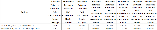
Looking at the RPI and the Balanced RPI, the following table shows how team ranks for those systems compare to team ranks as strength of schedule contributors:


As the table shows, the RPI's ranks of teams as strength of schedule contributors differ considerably from the teams' RPI ranks.  The average difference between those ranks is almost 30 positions.  At least half of all teams have a difference of at least 21 positions.  And the largest difference over the years has been 144 positions.

On the other hand, for the Balanced RPI, the average difference between those ranks is only 0.3 positions.  At least half of all teams have a difference of no positions.  And the largest difference is only 3 positions.

The RPI's differences between RPI ranks and strength of schedule contributor ranks make it possible to trick the rating system.  I will give an example from the 2023 season:

UCF  RPI Rank 45  Strength of Schedule (SoS) Contributor Rank 93  (Big 12 #7 ranked conference)

Liberty  RPI Rank 46  SoS Contributor Rank 10  (Conference USA #17)

Arizona State  RPI Rank 47  SoS Contributor Rank 84  (Pac 12 #4)

Thus although the RPI Ranks say these teams were essentially equal, their contributions to the strength of schedule components of their opponents' ratings were very different.  Essentially, Liberty was a very desirable opponent from an RPI perspective and UCF and Arizona State were not.

Here are some similar examples from 2023:

Michigan  RPI Rank 50  SoS Contributor Rank 123  (Big 10 #3)

Lamar  RPI Rank 51  SoS Contributor Rank 15  (Southland #26)

LSU  RPI Rank 52  SoS Contributor Rank 122  (SEC #1)

**************************************************

Pepperdine  RPI Rank 40  SoS Contributor Rank 69  (West Coast #8)

Towson  RPI Rank 41  SoS Contributor Rank 12  (Colonial #14)

Providence  RPI Rank 42  SoS Contributor Rank 60  (Big East #6)

In each example, from a strength of schedule contribution perspective, all of the teams from the strong conferences were undesirable opponents.  On the other hand, all of the teams from the weaker conferences were desirable opponents.  Why does this happen?  As compared to comparably ranked teams from stronger conferences, teams from the weaker conferences' tend to have better winning percentages but poorer strengths of schedule.  When the RPI formula evaluates teams as strength of schedule contributors, it evaluates them almost entirely (80%) based on their winning percentages.  Thus if you have two teams with RPI Ranks about the same, with one from a weaker conference and the other from a strong conference, you ordinarily want to play the one from the weaker conference.  Even though the two teams' RPI ranks are about the same, the team from the weaker conference will give a better contribution to your RPI strength of schedule.  This is not always the case, but most of the time it is.

Because of this RPI phenomenon, smart scheduling can trick the RPI, making the RPI think you have played a stronger schedule than you really have played.  This is one of the reasons basketball stopped using the RPI.

The Balanced RPI does not have this defect.  Teams' Balanced RPI ranks match their Balanced RPI ranks as strength of schedule contributors.  The above teams' 2023 ranks are examples:

UCF  Balanced RPI Rank 38  Balanced RPI SoS Contributor Rank 38

Liberty  Balanced RPI Rank 67  Balanced RPI SoS Contributor Rank 67

Arizona State  Balanced RPI Rank 41  Balanced RPI SoS Contributor Rank 41

Michigan  Balanced RPI Rank 33  Balanced RPI SoS Contributor Rank 33

Lamar  Balanced RPI Rank 105  Balanced RPI SoS Contributor Rank 105

LSU  Balanced RPI Rank 59  Balanced RPI SoS Contributor Rank 59

Pepperdine  Balanced RPI Rank 36  Balanced RPI SoS Contributor Rank 36

Towson  Balanced RPI Rank 69  Balanced RPI SoS Contributor Rank 68

Providence  Balanced RPI Rank 48  Balanced RPI SoS Contributor Rank 47

In fact, I designed the computation method for the Balanced RPI specifically to accomplish this.  Thus it is not possible to trick the Balanced RPI.

This means that if the NCAA were to shift to the Balanced RPI, it would make coaches' non-conference scheduling much easier.  With the RPI, coaches with NCAA Tournament aspirations must take care to pick and choose the right teams to play, in the different rank areas they want for their opponents.  In each rank area, some opponents will be good from an RPI perspective and other opponents will be bad.  With the Balanced RPI, this will not be the case.  Any team in a rank area will be just as good an opponent to play as any other team in that rank area.

To put it differently, from an RPI perspective, what you see for an opponent (RPI rank) often is not what you will get (RPI strength of schedule contribution rank).  For the Balanced RPI, however, what you see always is what you will get.

Is the System Able to Rank Teams from a Conference Properly in Relation to Teams from Other Conferences?

The following tables show how well the systems do when rating teams from a conference in relation to teams from other conferences.  In the tables, a conference "performance percentage" of 100% means that on average the conference's teams, in their games against teams from other conferences, perform in accord with their ratings.  A performance percentage above 100% means that the conference's teams perform better than their ratings say they should -- they are underrated.  A performance percentage below 100% means the conference's teams perform more poorly than their ratings say they should -- they are overrated.

One should not expect any rating system to produce ratings and ranks that exactly match all game results.  Rather, when looking at all of the conferences, one should expect a range of conference performance percentages with some above 100% and some below, but with all hopefully within a narrow range.  When evaluating and comparing rating systems from a conference perspective, this raises an important question: How narrow is a system's range of conference performance percentages, with smaller ranges being preferable.

a.  Most Underrated and Overrated Conferences.  


This table evaluates how the systems perform when looking at the most closely rated 10% of games.  These are the games in which results inconsistent with ratings are most likely to show up.

Looking at the RPI row, the High column shows the performance percentage -- 122.0% -- of the conference that most outperformed its ratings in non-conference games.  The Low column shows the performance percentage -- 68.1%, or 31.9% below 100% -- of the conference that most underperformed its ratings.  One could say that the High conference performed 22.0% better than its ratings say it should and the low conference performed 31.9% more poorly.  The Spread column is the sum of these two numbers: 53.9%.  This Spread -- or range -- is one measure of how the RPI performs from a conference perspective: the lower the number, the better the performance.

Looking at the KPI, its Spread is 72.7%.  This is worse than the RPI.

Looking at the Balanced RPI, its spread is 41.8%.  This is the best of the three systems.

As a note, however, about the KPI:  This method of analysis looks at relatively narrow slices of data, which creates the possibility of misleading results when the overall data sample is small.  For the RPI and Balanced RPI, where the analysis is based on all games from 2010 through 2023, the data sample is large.  For the KPI, the data sample is smaller, limited to games played since 2017.


This table is the same as the previous one, but for the most closely rated 20% of games.  It simply is a larger data set than the previous one.  Again, the Balanced RPI does the best, the RPI is significantly poorer, and the KPI is the worst.


This table is similar, but slightly different.  The games are sliced into the most closely rated 10%, the second most closely rated 10%, the third most closely rated 10%, and so on through all the games.  Each 10% slice has a conference performance percentage for each rating system.  In the table, the columns show the averages across all the slices.

Thus for the RPI, the conference with the High average performance percentage across all the slices has a performance percentage of 113.7%.  Effectively, its results are better than its ratings say they should be in 13.7% more games than would be normal.  The Low conference is at 87.8%.  The Spread between the two is 25.9%.

For the KPI, the Spread is 28.8%.

For the Balanced RPI, the Spread is 7.0%.

Thus for these measures of rating system performance, the Balanced RPI is much better than the RPI and KPI at rating teams from a conference in relation to teams from other conferences.  And of the three systems, the KPI is the worst.

b.  Amount of Underrating and Overrating for All Conferences.  The preceding tables looked at the most underrated and overrated conferences.  The following tables look at the combined amount of underrating and overrating for all conferences by asking: By what amount does a system miss a 100% performance percentage for each conference; and what do the those amounts for all conferences add up to?


In this table, the Over and Under column shows, for the most closely rated 10% of games, the total amount by which all conferences' performance percentages miss 100%.  The Balanced RPI performs the best, missing by 220.0%, followed by the RPI at 291.0% and the KPI at 437.0%.


For the most closely rated 20% of games, again the Balanced RPI performs the best, missing by 164.6%, with the RPI at 257.6% and the KPI at 394.2%.


Looking at the average across all the 10% slices, the Balanced RPI again is the best at 40.5%, much better than the RPI at 148.5% and the KPI at 160.2%.

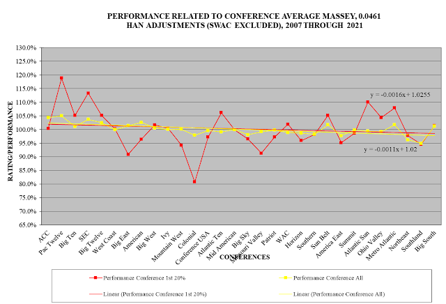
c.  Bias in Relation to Conference Strength.  The above two sets of tables show how the systems do generally at rating teams from a conference in relation to teams from other conferences.  The following three charts, one for each system, show how the conference misses of the "perfect" 100% performance percentage relate to conference strength:


This chart is for the RPI.  It has the conferences arranged in order of their average RPI ratings over the 2010 to 2023 period, ranging from the conference with the best average RPI rating on the left to the conference with the poorest rating on the right.  The vertical axis is for the conference performance percentage over this period.

The straight lines on the chart are computer-generated trend lines that paint a picture of the pattern the RPI has in rating teams from the different conferences in relation to each other.  The orange line is for the most closely rated 10% of games, the red line for the most closely rated 20%, and the blue line for the average across all the 10% slices.  Although there are variations from conference to conference, the gist of the chart is clear:  The stronger the conference, the greater the extent to which the conference's teams overperform in relation to their ratings -- in other words, the more the RPI underrates them; and the weaker the conference, the greater the extent of its underperformance -- in other words, the more the RPI overrates them.

Note:  In this and other charts I will show, I have not included the Southwestern Athletic Conference (SWAC).  I have excluded SWAC because its performance percentage is far poorer than that of any other conference.  If I were to include it, the downward angle of the trend lines would be even sharper, in my opinion overstating the amount of the rating systems' discrimination.

In the upper right hand corner of the chart, you can see three formulas.  These are for the trend lines, with the closest 10% of games trend line formula at the top, followed by the 20% formula and then the "all 10% slices" formula.

The next chart is for the KPI:


The next chart is for the Balanced RPI:


The next chart is for Massey.  This chart shows results for only the most closely rated 20% of games and all the 10% slices of games.


Using the trend line formulas, it is possible to quantify the amount by which each rating system tends to underrate the strong end of the conference spectrum, on the left, as compared to overrating the weak end of the spectrum, on the right.  The gap between those two amounts is a representation of the extent of the system's discrimination in relation to conference strength.

The following table shows the extent of the systems' discrimination, for the most closely rated 10% of games:


As you can see, for the most closely rated 10% of games, the strongest conference tends to perform 10.9% better than its ratings say it should whereas the weakest conference tends to perform 11.4% more poorly.  The Spread between the two is 22.3%, which is a measure of the RPI's discrimination in relation to conference strength.

For the KPI, the Spread is 19.1%.

For the Balanced RPI, the Spread is -2.0%.

The following table is for the most closely rated 20% of games:


Here is the table for the average across all the 10% slices:


As the tables show, the RPI and KPI produce ratings that discriminate in relation to conference strength, discriminating against teams from stronger conferences and in favor of teams from weaker conferences.  For the Balanced RPI, however, the Trend Spreads are low enough to indicate no effective discrimination.

The RPI's overall failure to properly rate teams from a conference in relation to teams from other conferences, and its pattern of discrimination against stronger and in favor of weaker conferences, appear to be a result of its defective method of calculating teams' strength of schedule contributions to their opponents.  This is why the Balanced RPI, with its corrected method of computing strength of schedule contributions, also remedies the RPI's improper rating of a conference's teams in relation to teams from other conferences.

As for the KPI, since its strength of schedule contribution calculation method is not available, it is not possible directly to say that is the source of its conference problem.  Nevertheless, the similarities between the RPI's conference problem and the KPI's conference problem suggest the KPI may have a strength of schedule problem similar to the RPI's.

Is the System Able to Rank Teams from a Geographic Region Properly in Relation to Teams from the Other Geographic Regions?

Based on a study of the geographic areas within which teams from each state play either the majority or the plurality of their games, the country has four regions.  These are not the same as the geographic regions the NCAA uses for some organizational purposes.  Rather, they represent where teams from the states tend to play their games.


The following material shows how the rating systems perform when rating teams from a region in relation to teams from other regions.  It uses the same method as used above for conferences.

a.  Most Underrated and Overrated Regions.  The following tables show how well the systems do when rating teams from a region in relation to teams from other regions.


As you can see, for the most closely rated 10% of games, the RPI and KPI both have a large Spread between the best-performing region and the poorest.  The Balanced RPI, on the other hand, has a small Spread.


The pattern is similar for the most closely rated 20% of games.


For the average across the 10% slices, the pattern again is the same.

Looking at all three tables, the RPI and KPI are not able to properly rate teams from the different regions in relation to each other.  For practical purposes, however, the Balanced RPI, for this measure, does a good job properly rating them in relation to each other.

b.  Amount of Underrating and Overrating for All Regions.


This shows the combined amounts by which each rating system misses a "perfect" 100% performance percentage for each region, using the different slices of games.  As you can see, the RPI and KPI both miss by large amounts.  The Balanced RPI misses, however, are small and for practical purposes mean the Balanced RPI, for this measure, properly rates teams from the regions in relation to teams from other regions.

c.  Bias in Relation to Region Strength.


This chart is for the RPI.  Along the horizontal axis, the regions are in order from the region with the best average rating on the left to the poorest on the right.  According to the trend lines, the RPI discriminates against stronger regions and in favor of weaker ones.  On the other hand, the ups and downs of the chart suggest that other factors also may be at play.


For the KPI, the chart is very similar to the one for the RPI.


For the Balanced RPI, on the other hand, the chart shows minimal, if any, discrimination in relation to region strength.

Here is the chart for Massey:


Use of the trend line formulas from the charts produces the following table:


As you can see, for each of the slices of games as well as for all the slices combined, both the RPI and KPI have significant discrimination in relation to region strength.  The Balanced RPI, on the other hand, for all practical purposes does not discriminate.

Similar to the case with conferences, the RPI's overall failure to properly rate teams from a region in relation to teams from other regions, and its pattern of discrimination against stronger and in favor of weaker regions, appear to be a result of its defective method of calculating teams' strength of schedule contributions to their opponents.  This is why the Balanced RPI, with its corrected method of computing strength of schedule contributions, also remedies the RPI's improper rating of a region's teams in relation to teams from other regions.

From a Simple Game Results Perspective, How Consistent Are a System's Ratings with Game Results?

The final two evaluation and comparison factors look simply at the correlations between systems' ratings and game results (without regard to conference or region).


This chart is based on calculations that ask the following question: After adjusting for home field advantage, how often does the team with the better rating win, tie, and lose?

Using the RPI as an example, and remembering that for the RPI this is based on all games played since 2010 with the game results as they would have been with no overtimes, the higher rated team won 65.3% of the time, tied 21.1%, and lost 13.6%.

I have a highlight shadow for the KPI numbers because its 2017 through 2021 underlying data include the results of overtime games and thus are not good for an apples to apples comparison to the RPI and Balanced RPI numbers, which include far more ties.

For the Balanced RPI, the higher rated team won 65.8% of the time, tied 21.1%, and lost 13.0%.  (The numbers do not add up to 100% due to rounding.)

Thus the Balanced RPI does better than the RPI by 0.5%.  This is not a large difference.  Each 0.1% represents 3 games out of a roughly 3,000 game season.  Thus the Balanced RPI does better by matching game results for about 15 more games per year, out of 3,000 games.

To get a better comparison of how the KPI performs in relation to the RPI and Balanced RPI, the column on the right of the above table disregards ties and asks:  Of the games that were won or lost, what proportion did the better rated team win?  As you can see from that column, the Balanced RPI ratings were the most consistent with results for those games, followed by the RPI and then the KPI.


This final table is for games that involved at least one Top 60 team.  For this table, it is important to note that since each system has its own set of Top 60 teams, the numbers of ties are different.  This makes the Disregarding Ties column the most important indicator of how a system does for this subset of teams.  As you can see, the Balanced RPI does the best when disregarding ties, followed by the RPI and then the KPI.

These differences again are not large.  For this subset of games, a difference of 0.1% represents ratings matching game results for 1 more game per year out of roughly 1,000 games in the subset.

Final Comments

As the above analysis shows, there is a big disconnect between teams' RPI ranks and their RPI ranks as strength of schedule contributors.  This makes it possible to trick the RPI by employing certain scheduling tactics and, as a result, makes non-conference scheduling difficult for teams with NCAA Tournament aspirations.  The Balanced RPI does not have this problem and thus would make non-conference scheduling much easier.

The RPI's strength of schedule defect causes the RPI to be poor at properly rating teams from conferences in relation to teams from other conferences and teams from regions in relation to teams from other regions.  By eliminating that defect, the Balanced RPI also eliminates the RPI's conferences and regions defect.

The KPI is similar to the RPI in being poor at properly rating teams from conferences and regions in relation to teams from other conferences and regions.  This suggests that it likewise may have a strength of schedule measurement defect, but it is not possible to verify this due to a lack of information about how the KPI computes strength of schedule.

The Balanced RPI ratings are slightly more consistent with game results than are the RPI and KPI ratings, but the differences in consistency are small.  From a rating system perspective, this is not surprising.  In rating systems comparisons, the range of correlation rate differences between ratings and results ordinarily is small.  Thus in comparing systems, the question is not what those correlation results are but rather how the cases where "ratings do not match results" are distributed.  In an ideal system, the cases are distributed randomly so that over time they affect all teams more or less equally.  The problem with the RPI and KPI is that the "ratings do not match results" cases are not distributed randomly.  Rather, they affect teams from different conferences and different regions in unequal ways and in addition have a specific pattern of discriminating against teams from stronger conferences and regions and in favor of teams from weaker conferences and regions.  The Balanced RPI, however, does not have this problem and instead appears to have the desired random distribution of misses so that over time no conference's or region's teams are favored or disfavored.

Computing the Balanced RPI

RPI Element 1 is the NCAA's Winning Percentage

RPI Element 1 is the NCAA's Opponents' Winning Percentage

RPI Element 3 is the NCAA's Opponents' Opponents' Winning Percentage

Computation 1:

URPI 50 50 SoS: 

(RPI_Element_1+(RPI_Element_2*1.4)+(RPI_Element_3*2.4))/4

[Note: This is the same as the NCAA's basic RPI formula except that the Element 2 and Element 3 multipliers are 1.4 and 2.4 respectively rather than the NCAA's 2 and 1.  The effect of this is to change the effective weights of the three elements from the NCAA's 50%-40%-10% to 50%-25%-25%.]

 Computation 2:

URPI 50 50 SoS Iteration 2:

(RPI_Element_1+4.5*(Opponents_Average_URPI_50_50_SoS-0.135))/4

[Note: This treats the first calculation of a team's RPI rating (from Computation 1) as its contribution to its opponents' strengths of schedule.  The 4.5 multiplier applied to the Opponents' Average URPI 50 50 SoS is to give RPI Element 1 (Winning Percentage) and the Opponents' Average URPI 50 50 SoS (Strength of Schedule) each a 50% effective weight.  The .135 subtracted towards the end of the equation simply is a centering adjustment to keep the ratings within a range we are used to seeing for RPI ratings.]

Computation 3:

URPI 50 50 SoS Iteration 3:

(RPI_Element_1+4*(Opponents_Average_URPI_50_50_SoS_Iteration_2-0.135))/4

[Note: This equation is the basic format for each of the remaining computation steps.  It treats the result of the preceding computation as the strength of schedule component of the RPI.  The 4 multiplier applied to the Opponents' Average URPI 50 50 SoS Iteration 2 is to give RPI Element 1 (Winning Percentage) and the Opponents' Average URPI 50 50 SoS Iteration 2 (Strength of Schedule) each a 50% effective weight.  The .135 centering adjustment is to keep the resulting ratings within a range we are used to seeing.  The 4 multiplier and .135 centering adjustment are constants for all the remaining calculation steps.]

Computation 4:

URPI 50 50 SoS Iteration 4:

(RPI_Element_1+4*(Opponents_Average_URPI_50_50_SoS_Iteration_3-0.135))/4

 Computations 5 through 14:

URPI 50 50 SoS Iterations 5 through 14:

These computations follow the same pattern as Computations 3 and 4.

 Computation 15:

Balanced RPI:

(RPI_Element_1+4*(Opponents_Average_URPI_50_50_SoS_Iteration_14-0.135))/4

[Note: For the period from 2010 through 2023, on average this produces effective weights for Winning Percentage and Strength of Schedule of exactly 50% each.]